
How can we measure user experience? I used the Chrome UX report and analyzed it in BigQuery.
We looked at over 7 million unique websites that were visited in May 2020 using Google Chrome.
We focused on a metric called the First Contentful Paint (FCP), which tells us how long it took before a person sees the first object on the website.
We categorized each website visit as having a Fast, Average, or Slow FCP.
We then discovered that more than 50% of websites have fast FCP times. Average is no longer the standard, my friend.
Speed has become such a vital aspect of the web user experience. How long are you willing to wait for a website to load? Anything more than 1.5 seconds is no longer considered fast.
What is User Experience (UX)?
Let’s look at an example. A microwave is a product that’s easy to use. Open the microwave door, put your food, close the door, press the button, and walk away.
Afterwards, you return to food that is perfectly warmed up.
A microwave provides a very delightful experience.

How do we define user experience (UX) on the web?
People read blogs, shop and watch online, and talk to other people.
There’s a lot of things to do online, and everyone has their own unique experience. This is web UX.
We want everyone to have a delightful web user experience, right?
An experience can only be either good, or bad.
We feel frustrated if a website is not user-friendly.
At times, the fonts looked good on our computer, but becomes too small when we use our smartphones.
The colors are too bright, or the color theme is inappropriate.
All of this leads to bad user experience.
On the other hand, some websites are very easy to use.
If you’re looking to buy online, you want to see the buttons clearly.
You want the reviews to be visible.
Most importantly, you want the entire buying experience to be done in the shortest possible time.
This leads to good user experience.
The people at The Daily Egg explained this in more detail. Over the years, as we see more websites, we began to establish several criteria to determine if a website is providing a good user experience to everyone.
How Do We Measure the Quality of UX on the Web?

Ask yourself, aside from the content, what makes you like a website? What makes you stay?
Some people say that the less ads, the less cluttered a website looks, and in turn, gives a better experience.
Some people like how the buttons are placed. Older people want to have bigger text.
Light sensitivity is important. A lot of social media platforms are developing Dark Themes for their websites and apps. This makes it easier for us to use them at night, or when the lights are out very early in the morning.
If a site has good navigation such as headers and sidebars, it becomes easier to go from one page to another.
If a page takes too long to load, we simply don’t have the time, and move on to another site.
Our attention span has become really low, right?
These are just some of the things we look at when we want to identify which sites give a better User Experience (UX) over another.
First Contentful Paint (FCP)
When we open a page for the first time, we get the impression that the page is working properly the moment we see content.
This content can be an image or text, or even a sound.
We call this the First Contentful Paint, and it is extremely helpful to measure and build the user experience.
The entire page can take 3 to 5 seconds to fully load. However, once we see the logo or the header, we feel at ease.
We have the confidence that the website is responding. We just have to wait for another second or two, and that’s okay.
The FCP is one of the many metrics that websites are looking to improve constantly. For more information, you can check out this GTmetrix blog article.
Looking at the chrome-ux-report Dataset in BigQuery
Google is collecting information on FCP when people use the Chrome browser.
This set of information, called Chrome UX report, is a publicly available dataset in BigQuery. This report also contains other metrics aside from FCP.
Clicking on the external link below will automatically take you to the dataset.
EXTERNAL LINK: Public Google BigQuery Project for Chrome UX
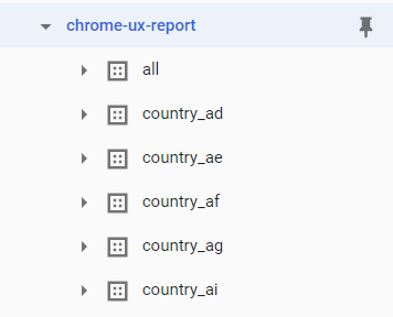
Inside the chrome-ux-report dataset, we see data for each country, e.g. country_us. We also see a combined data for all countries, named all.
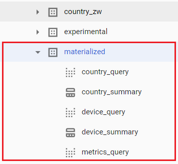
We also have pre-processed results that give us information on some commonly used metrics. If you scroll to the bottom part, you will see a dataset named materialized, which has some interesting metrics too.
The table above named country_summary was made through a complex query which involves array UNNEST functions, and other manipulations. If you are serious about making custom CRUX analyses, I recommend reading up on arrays.
RELATED: Working with Arrays in BigQuery
You can also click on the country_query to see the actual query. This makes it easier for us to make small modifications on our own.
Here’s a simple query that I prepared for us to identify global performance on FCP across different devices (desktop, tablet, and mobile phone). We will look at the benchmark for the month of May 2020.
SELECT
  form_factor.name AS user_device,
  SUM(IF(start < 1500, density, 0)) / SUM(density) AS fast_fcp,
  SUM(IF(start >= 1500 AND start < 2500, density, 0)) / SUM(density) AS avg_fcp,
  SUM(IF(start >= 2500, density, 0)) / SUM(density) AS slow_fcp
FROM
  `chrome-ux-report.all.202005`,
  UNNEST(first_contentful_paint.histogram.bin) AS fcp
GROUP BY user_device;
We define Fast, Average, and Slow FCP using these thresholds.
| Category | Speed |
|---|---|
| Fast | less than 1500 milliseconds |
| Average | 1500 to less than 2500 milliseconds |
| Slow | 2500 milliseconds or more |
On your BigQuery console, you should be able to see this.
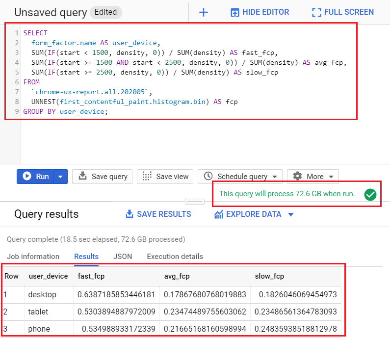
This image shows us the query, and how much of your processing data (quota) it will use for this single query. For the May 2020 dataset, the query used 72.6 GB of querying costs.
After running the query, the results at shown at the bottom section.
Visualizing First Contentful Paint
Let’s visualize the results using a simple stacked bar chart in Microsoft Excel.
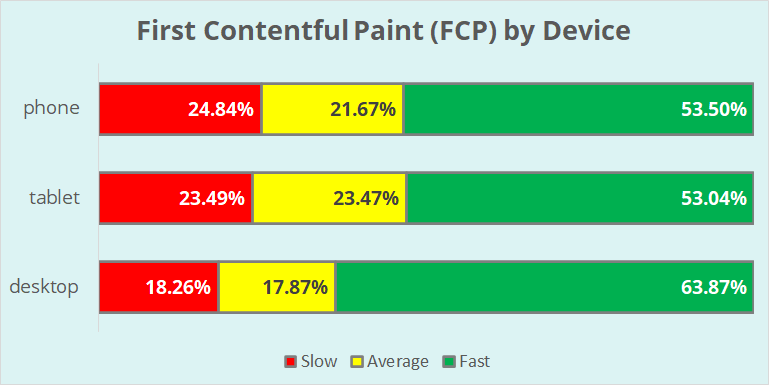
We see that more than half of all website visits in May 2020 are showing their first content in less than 1500 milliseconds, or 1.5 seconds.
We analyzed 7,103,486 unique websites that were visited at least once in May 2020. The query took a few seconds, and this is just looking at one metric.
Looking at the global performance of websites, regardless if they are e-commerce sites, blogs, or static pages, we see one common theme.
Average is no longer average, as all sites are exerting effort to improve the user experience.
As we see from the data, majority of the websites have Fast FCP, and not average.
What’s worse, if a website has a Slow FCP (takes 2.5 seconds or more to show its first content), that’s dangerously slow, and the website needs to be improved.
Conclusion
In this article, we showed how a Data Analyst can harness data that is publicly available in Google to analyze user experience (UX) on the web.
We focused on the First Contentful Paint (FCP) metric, which tells us the time when users see the first content on the page that they visit.
The chrome-ux-report is a public dataset and we can access it even without an upgraded (paid) account in Google BigQuery.
There are other metrics that we can explore, such as Time to First Byte (TTFB), First Input Delay (FID), Largest Contentful Paint (LCP), and Time to Interactive (TTI).
You made many of the terms easy to understand. 😀
Thanks, Ira!
I’ll keep in mind what you said about the FCP metric.
Yup! Although content is very important, people can be impatient at times (and this is perfectly normal).
I use GTMetrix and PageSpeed Insights as free tools to analyze my own site, and compare them to the blogs I’m also following.
Comments are closed.